/
Challenge
(01)
Arrichion had something most fitness brands don’t,
a proprietary training method 30 years in the making.
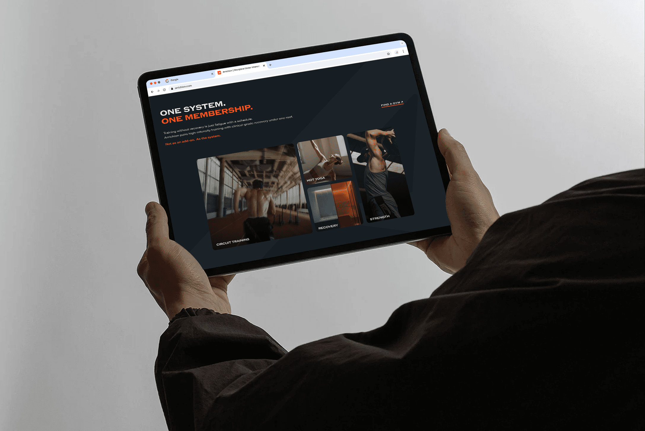
It blends hot yoga, strength, Pilates, and recovery into one performance system. Six locations. A franchise model ready to grow. But the brand told a different story at every touchpoint. Premium recovery
was buried.
The voice shifted between wellness and intensity. And in a franchise model, inconsistency doesn’t stay local - it scales.


/
Solution
(02)
We rebuilt Arrichion’s brand around what truly sets it apart - a coach‑led performance method rooted in community.
That began with a clear audience hierarchy: athletes and dedicated practitioners first; casual wellness seekers second; aspiring coaches third; franchise investors fourth. Each audience gets a distinct entry point, yet every touchpoint reinforces one belief: training is a commitment to process, not a shortcut.
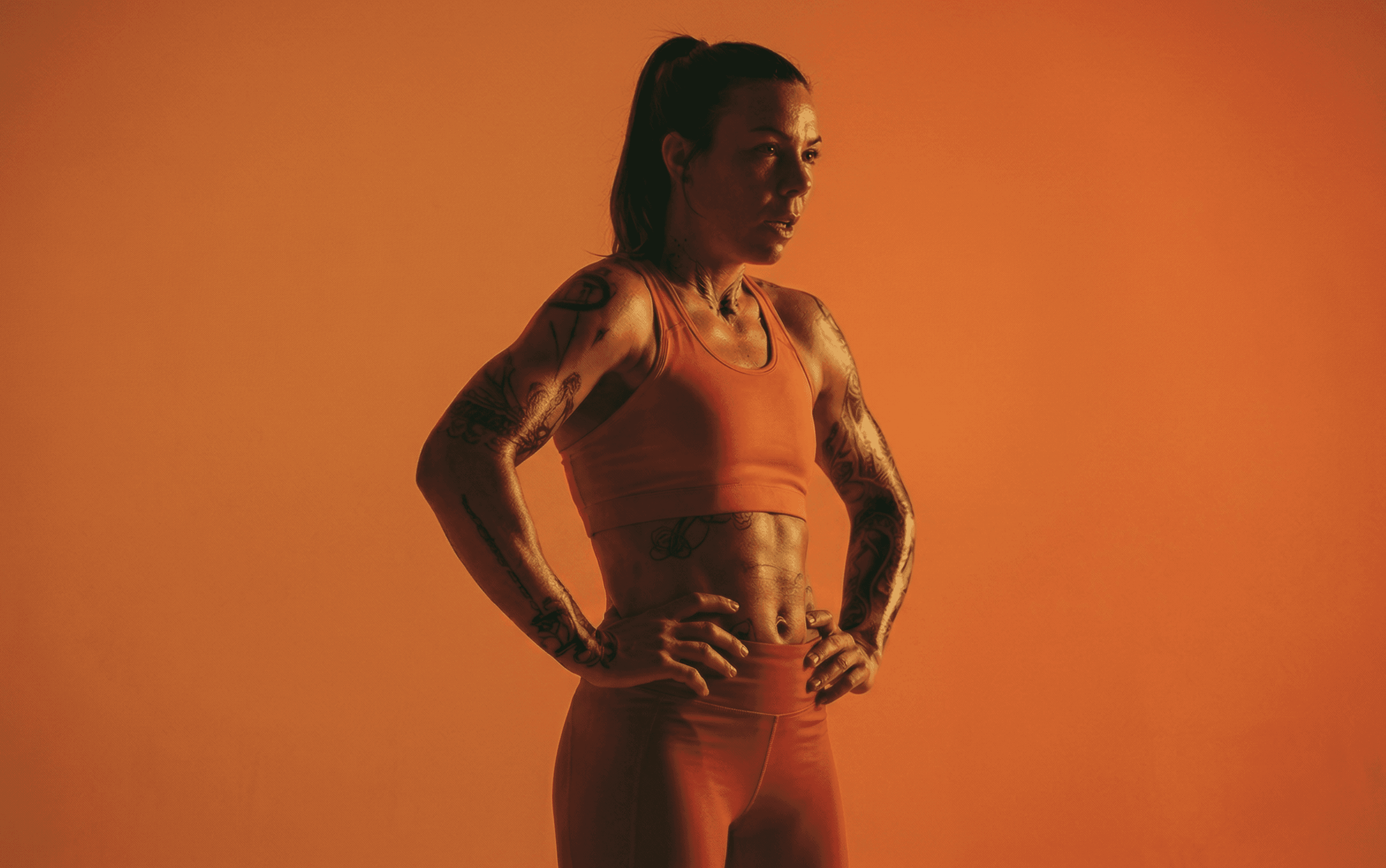
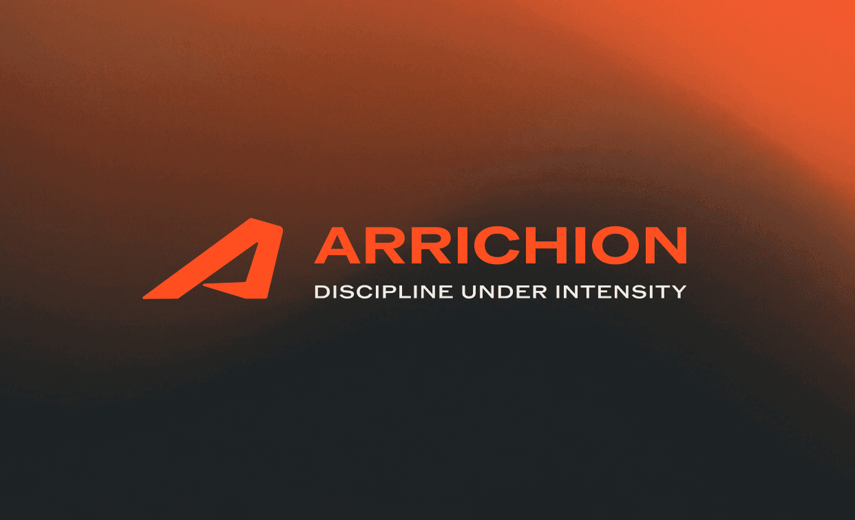
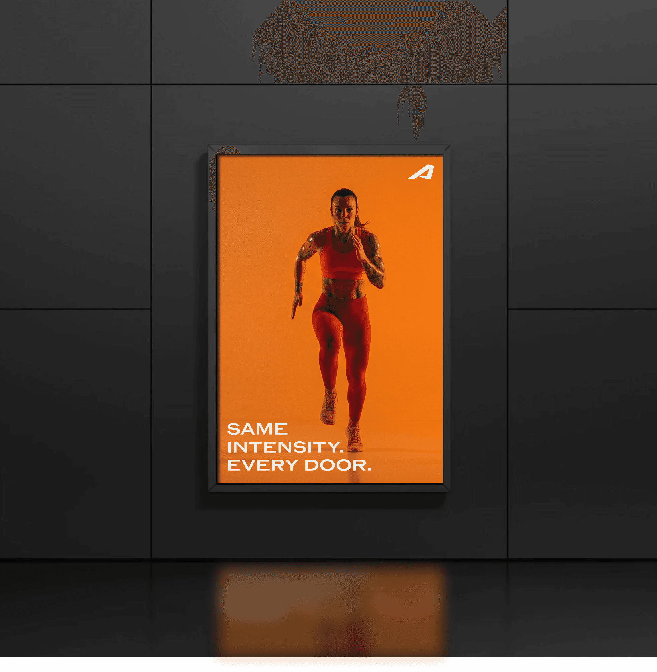
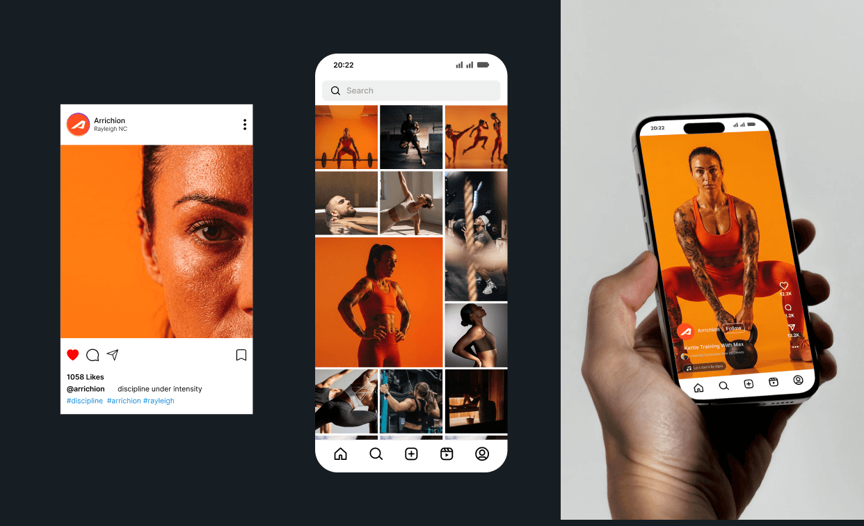
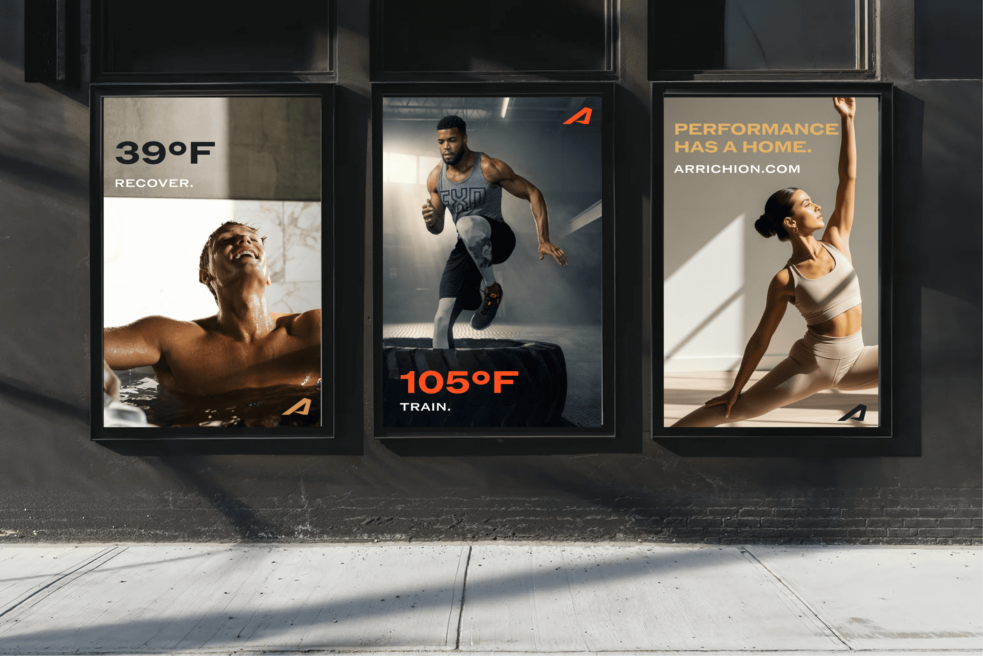
The identity system now carries that belief across six locations and beyond. It captures two truths about Arrichion - intense and welcoming. The brand had to feel as authoritative in a franchise pitch deck as it does on a studio wall in Charlotte. We built a language that leads with the coaching methodology, elevates recovery to a core pillar, and brings consistency without sacrificing local character.
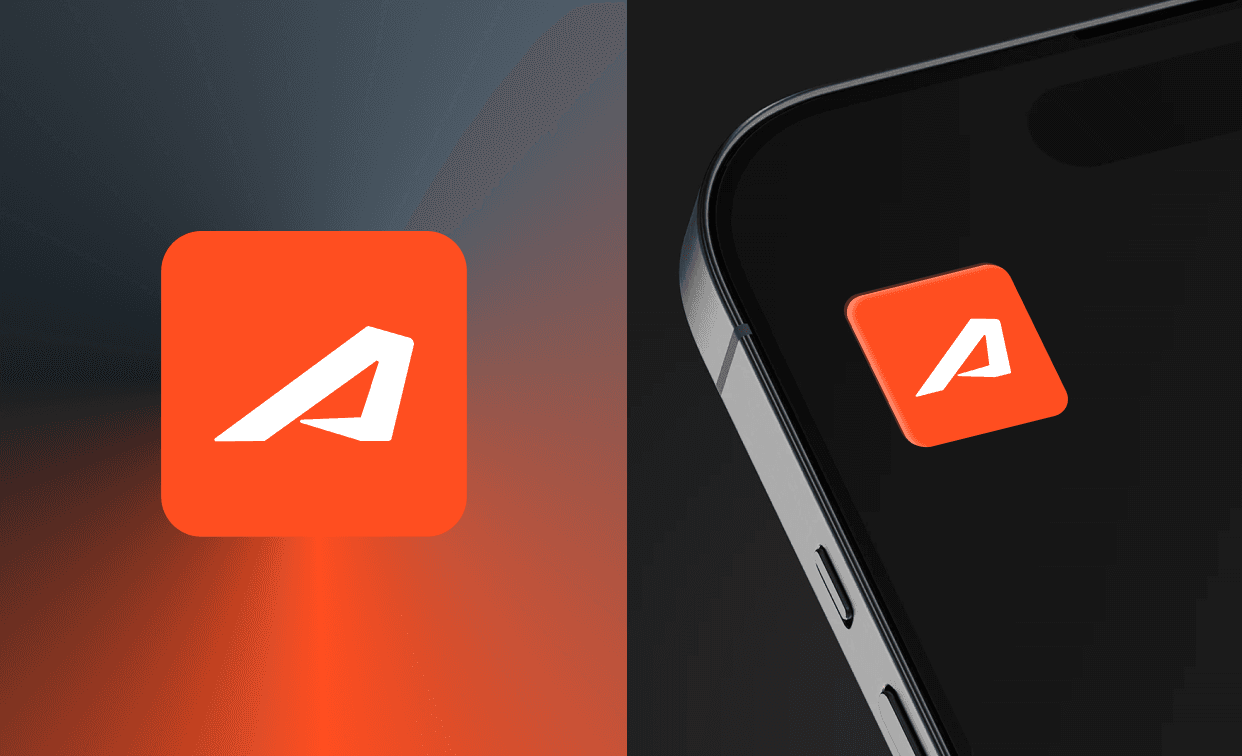
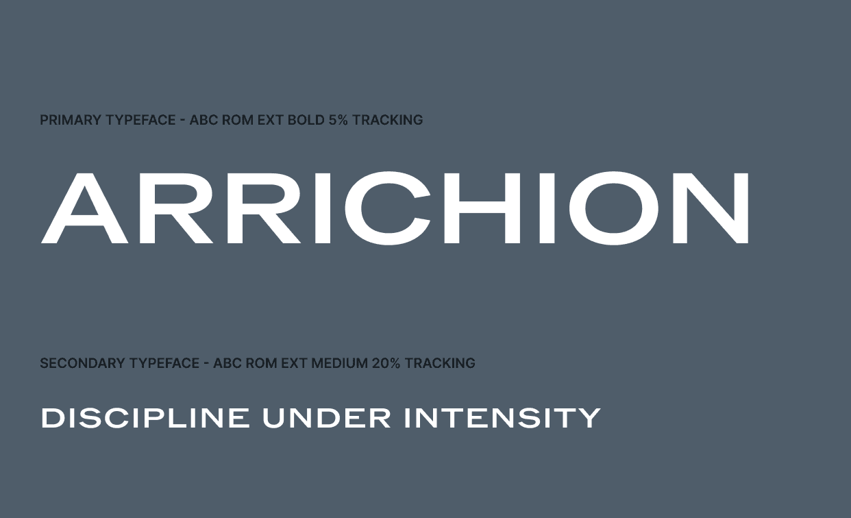
Typography, color, photography, and spatial guidelines were designed to replicate seamlessly - scalable without losing impact.


/
Conclusion
(03)
Arrichion now has the infrastructure to grow with confidence. A unified system aligned across physical studios, digital platforms, franchise materials, and marketing. Messaging that speaks to the right people in the right order.
And a visual language that matches the intensity and discipline of its method.
The brand now reflects what every member already knows - this isn’t a yoga class. It’s a performance system built on 30 years of coaching, ready for the next chapter.


Latest Projects.
© Studio Biocus
A curated selection of projects that reflect our commitment to simplicity and purposeful design.
View all projects
View all projects

